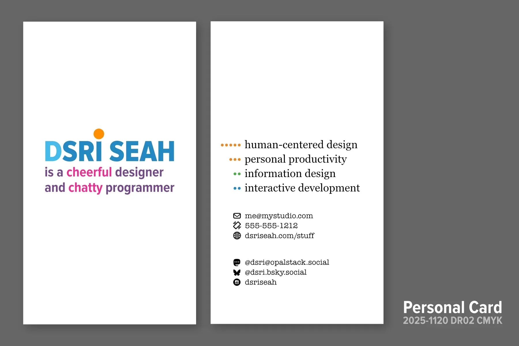
A quickie “personal card” design will give me something to hand out to people I meet. It emphasizes personal warmth on the front, and data on the back.

Between build projects I’ve been workshopping the personal business cards I prototyped in Build 11: Unprofessional Business Cards. In that version of the card, I started with some silly ideas and pushed it past my comfort level. In this version of the card, I’ve pulled it back a bit.
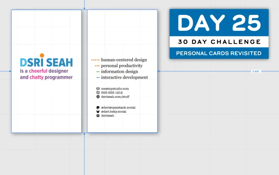
The Release Candidate

Important Design Considerations
- The major part of this year’s Groundhog Day ResolutionsThese values are to always been aligned with my personal authenticity, transparency, and curiosity. See GHDR 2025 Kickoff for the long-winded details! was to live according to my values and try to inject more whimsy into my personal expression. I don’t want to come across as super serious and technical.
- I need to have constant and friendly interaction in my work with people who care about our craft.
- I simultaneously use both emotional intelligence and analytical reasoning skills in problem solving, which is valuable but uncommon. These kind of “dualities” are nice to reflect in the design elements and in the text.
- These are temporary cards just so I have something nice to hand out when I meet people.
- These are the first printed cards that have my chosen name (Sri) on it, not my birth name.
Strategic Context
- As I mentioned in Important Design Considerations above, these cards are just so I have a way to give people my contact information.
- I still may have to make some kind of corporate branding for a new line of products under registrated trademark, but that’s at least six months out from now. It’s likely a year out.
New Design Elements
- It’s double-sided! The front is a personable statement, the back is more factual/technical. This mirrors Design Consideration 1.
- I’ve colored the D in DSRI to subtly emphasize that I go by “Sri” (pronounced “Sreee”)
- I’ve added a playful orange ball on top of the I in DSRI, which is reminiscent of tween girly handwriting to add a subtle cute vibe that makes me laugh.
- To imply continuity from the front side of the card, I’m using colored dots as bullet points on the back to imply a “continued” vibe
- The four bullet points are color coded to imply grouping of some kind. People connections are orange, information-related visual work is green, and technical stuff is blue.
Continuity with Old Cards
- I’ve retained the use of the DS BLUE color and the DS ORANGE color in my past branding, but have added fuscia, purple, and green Coincidentally, these colors are influenced by NTSC television based color used by the Apple II, which is a color palette burned into memory..
- The use of the orange dot with the blue color is a common color scheme I’ve used across previous business cards and my form designs.
Typography
- I’m continuing to use Proxima Nova Condensed for my typeface, though it’s become a lot more popular than when I first started using it.
- I’m using a Transitional serif font, Georgia, for the four things I’m doing these days. I like this font because—like all Transitional Serifs—it has the feel of Old Style fonts (feels “literary”), but is also open and well-balanced for the screen.
- I’m using American Typewriter for the contact information, as it has a similar open feel but is a bit more “data-shaped”
Color Conversion Tweaks
My original design was for the screen, but I’ve had to conver the colors into CMYK for ptinting. Unfortunately I’ve lost my Pantone Color Bridge swatchbook, and the price has risen 450% since 2009. Yikes! So I’ve made an approximation of the process colors for now.
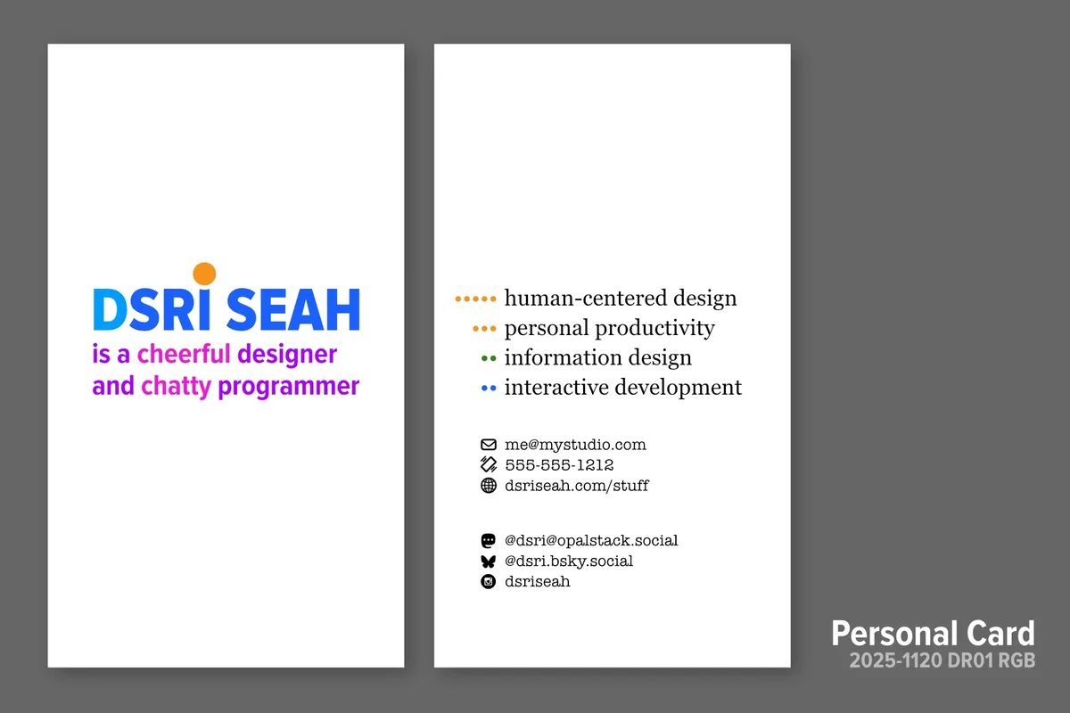
If you haven’t seen the RGB color version, the print CMYK version still looks pretty vibrant.
2025 Building Challenge Posts
Making an URSYS App Example
Adding Typescript support to Eleventy
Review of Old Design Work
Improving my Eleventy Atom Feeds
Managing a Productivity Crash
Activity Bingo Board: Layout with Affinity Designer
ETP 5885 Notebook Press Run Prep
Activity Bingo Board Revisions
ETP 5885 Notebook Press Tour
A Silly Pass at Logo Design
Unprofessional Business Cards
Word Counting Calendar PDF Quickie Reuse
Word Counting Calendar PDF Now Available!
Word Counting Calendar Preparing to Code
Word Counting Calendar Simple Beginnings
Articulating Friendship
First skip day due to day trip to Concord, etc.
Making a PDF-LIB Reference
Word Counting Calendar Drawing Blocks
Minimum Progress Despite Nausea
Word Counting Calendar Drawing Blocks II
Writing A Mythical Magical Adventure Cat Primer
Word Counting Calendar Drawing Days
Word Counting Calendar Drawing Spaces
A Restorative Visit to the North Shore
Word Counting Calendar: Alpha Release!
ETP 5885 Notebook Production Update!
Personal Cards Revisited
11/21 - Visiting an Old Friend in Beverly, MA
Experimental Collaboration
Short Productive Sprint Day
Thanksgiving Reset Break
ETP 5885 Notebook back on Amazon!
ETP 365 Day Journal Updated for 2026!
Making a Freelance Services Page
BUILD CHALLENGE COMMENTARY
I made most of the content and layout tweaks yesterday over several long hours, going to sleep at 4AM. Not great for pacing! It was fun to resolve the issues from a few weeks ago.
Today I reactivated my 4Over Print Reseller account to do a preflight check on the PDF files I made in Affinity Designer. They didn’t pass because while the document color was set to CMYK for print, I hadn’t actually converted the colors to CMYK. I thought that would happen automatically.
So, I spent the rest of the day figuring out the workflow of CMYK again. It’s been a while since I’ve had to do it, and I’m using new software. This is when I discovered I was missing my Pantone Swatch References. Replacing these swatch books also costs more than buying a new color printer. I wasted some time researching the Epson ET-8550 Eco Tank Large Format All-in-One and the Canon MegaTank GX5120 Print Only Small Office Printer but realized that I didn’t need to spend this money now. After talking to my friend Shannon, I decided I’d just try using the local printer to have cards printed on-demand to see what the process is like.
After I got the CMYK palette worked out (without proofing), I had to make print-ready PDFs for a double-sided card. This involve creating two separate PDFs. I discovered that Affinity Designer has an export mode that lets you output slices as PDF, which is super cool! I set up two art boards and named them to set the output file name. Then I set each artboard to export print-ready PDF files and clicked EXPORT. Et voila, it was done!!! Pretty awesome!
So…this took longer than I thought. But it was good to reimmerse myself into graphic design production. I like doing this kind of thing for myself, and that’s a good sign that I might enjoy doing more of this in the future.
Next up:
- The Shopify Store! It is completely out of date and I don’t remember how it works at all.
- The
dsriseah.com/stuffpage that’s referenced on the personal card doesn’t exist! This is a whole new front-end design challenge!!! - I’d also like to assemble a page for all the 30-Day Building Challenge that has little image thumbnails on the side. My current image code doesn’t have this yet, but it would be super cool to have.
Ooof! When does it end? Never!!!
BUILD 24/30: ETP 5885 Notebook Production Update!
Skip Day 04! Visiting an Old Friend in Beverly, MA
Chat about tools and aspirational projects on my DS|CAFE Discord server
Chat me up on Mastodon and Bluesky