
Today’s Sharepiece: Reflecting on Old Work
For a change of pace, I decided to thinking about the kind of work I wanted to start offering. It would be great to have business cards with my new website under the DSRI SEAH banner.
To start, I looked through old design work. I wanted to just get a “feel” for what used to be important to me and see how I felt about the work now. This might give me an idea of where I want to go in the future.
Textures of the Past
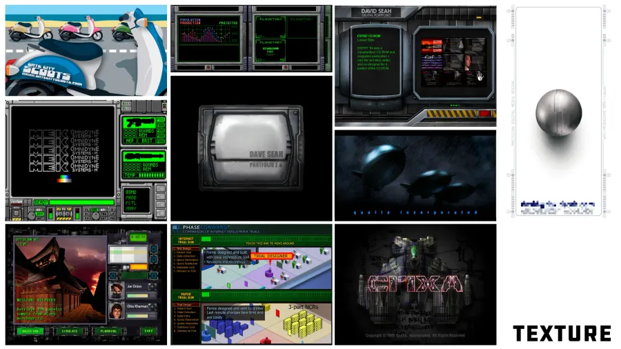

This work spans from 1988 to around 2007. A lot of it is user interface work for video games or interactive experiences. The oldest work is 320x200 16-color graphics on the Apple IIGS, and the most recent is late 1990s trade show work done in Macromedia Flash. There’s one outlier Adobe Illustrator business card design that’s probably from 2008 or so (upper left).
What stands out to me is a love for machinery and complexity in detail. I also like moody lighting and the green glow or CRTs. My first attempt at an identity graphic can be seen in the upper right. It was intended to represent my love of precision.
ARE THESE TEXTURES RELEVANT TODAY?
A lot of this work is for interface design for interactive experiences that aren’t in demand anymore. The rendering work was done in bitmap paint programs like DeluxePaint and Photoshop 3.0, carefully designed to look good on screens that could show only 16 or 256 colors at once. Today, all of this would be modeled, lit, and assembled in 3D; it’s an entirely different skillset that I’d have to learn from scratch.
That said, I do see that I’m practicing good information hierarchy design in the placement of screen elements. I think that’s something that I will want to carry through to new work. I like to imagine how things actually work.
Shapes of the Past

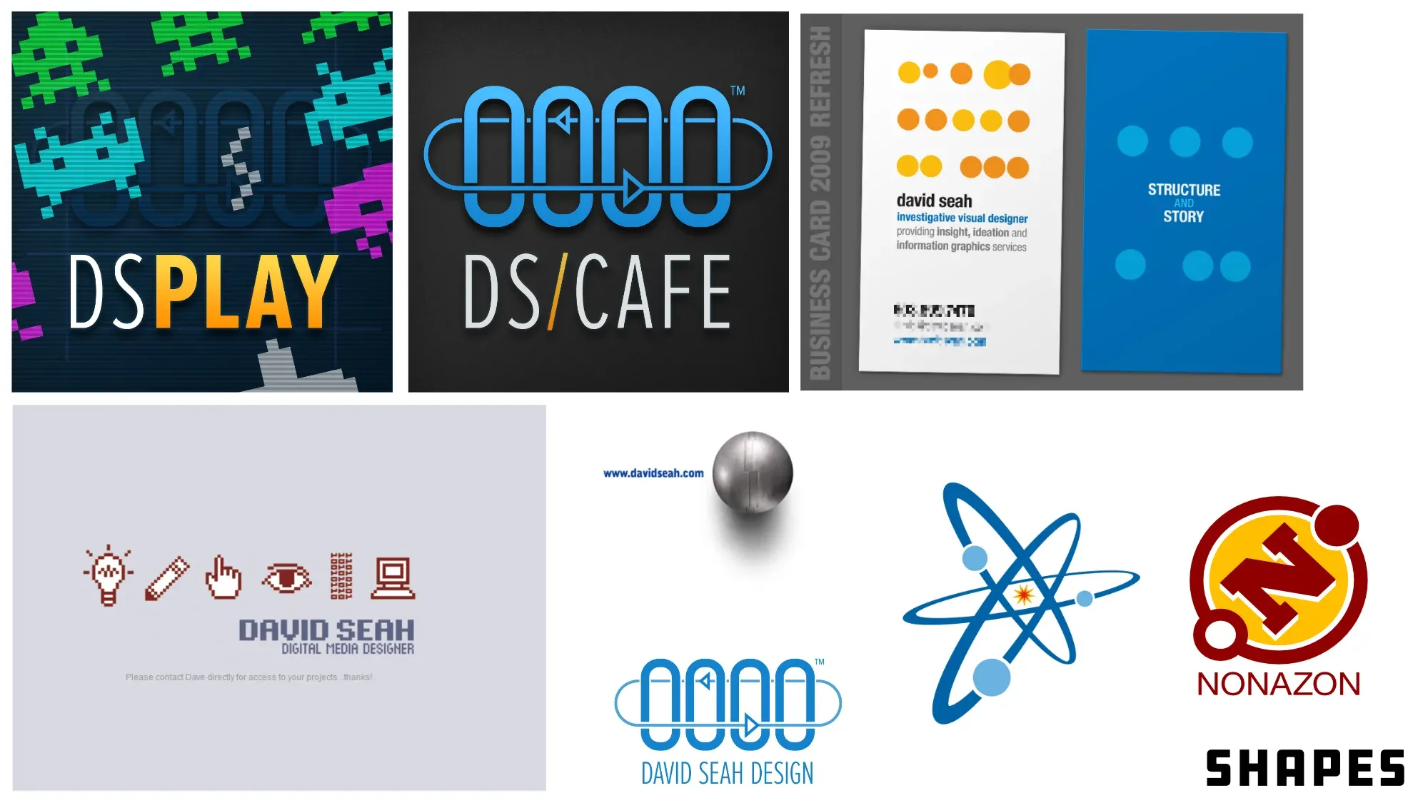
I don’t have a lot of vector artwork outside of my productivity forms. The dominant element in this set is the Seah Micro LogoSee the post The Genesis of the Seah Micro Logo which is repeated in the icons for my DS|CAFE and DS|PLAY Discord servers. This work ranges from around 2001 through 2012.
I do seem to like the idea of dots and atomic lines indicating a swirling motion, and there is also demonstration of Gestalt theory in the business card example (upper right). There’s a strong retro vibe to my linework and leaning on pixel art conventions. Symmetrical space-filling letterforms like Proxima Nova, DIN Mittelschrift, and Gorton appeal to my machine aesthetics.
I also show a preference for a particular kind of color palette, which admittedly is shaped by the old television NTSC colors generated on the Apple II computer of green/purple and orange/blue. These are complementary colors that were burned into my brain in the early computer graphics and computer gaming I did, and are distinct from the default color palettes from other computers of that era. In general, I’m also showing good control of tonal contrast between foreground and background colors, if I do say so myself. My kerning and linespacing is OK.
ARE THESE SHAPES RELEVANT TODAY?
I would say that this is still my baseline graphic style. I naturally use whitespace, color coding, and directional gestures to guide the eye from visual anchor to visual anchor. This is evident also in the texture work above, the balance of element sizes with their position and visual mass.
It’s not a particularly flashy skill, but it’s the foundation of the kind of graphic design that I do. I like my graphic design to map to concepts to ground them.
Business Cards of the Past

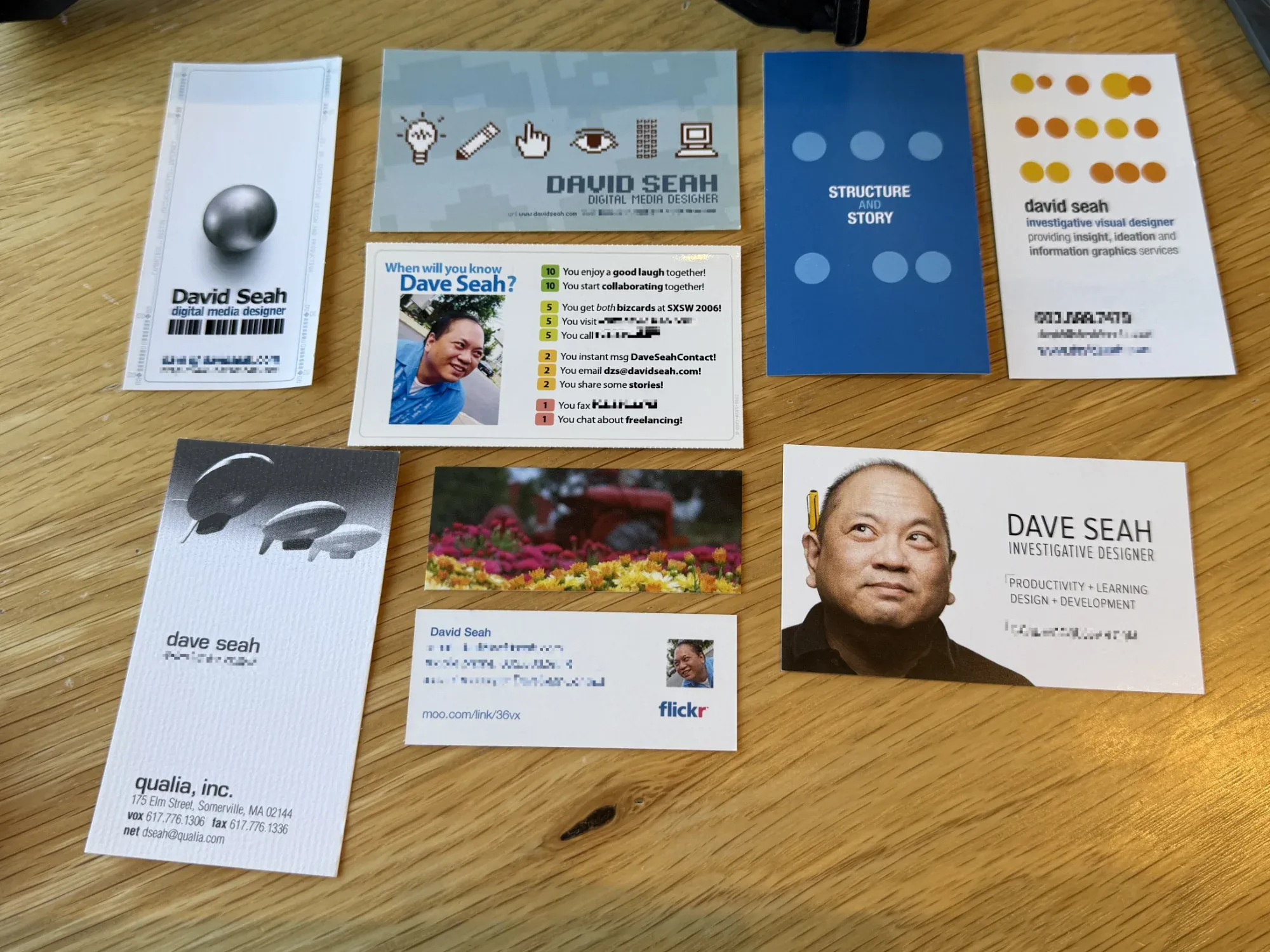
This is a selection of cards I have designed from 1995 through 2019. The Qualia, Inc. card was from my first interaction with a service bureau and used a fancy stochastic screening process I had done by hand; the printer didn’t think it would work but it came out great. The cluster of three cards in the upper left were printed on my inkjet printer for use at SXSW Interactive in the mid-2000s. The cards on the right side are my most recent cards, and feel a bit more professional.
None of them say DSRI on them, unfortunately, so that’s what I’m up against.
ARE THESE CARDS RELEVANT TODAY?
I don’t know. I want my card to say something about myself but I’m finding that I don’t know what to say. I also don’t know exactly how to explain what I’m offering. Technically, I don’t need to do either things. I just need my name and contact information on a card. It could be as boring as:
Figure 4. The world’s most boring card would probably work, but that’s no fun.
   DSRI SEAH
   human-centered systems architect
   information graphics and interaction consultant

   [contact information]
2025 Building Challenge Posts
Making an URSYS App Example
Adding Typescript support to Eleventy
Review of Old Design Work
Improving my Eleventy Atom Feeds
Managing a Productivity Crash
Activity Bingo Board: Layout with Affinity Designer
ETP 5885 Notebook Press Run Prep
Activity Bingo Board Revisions
ETP 5885 Notebook Press Tour
A Silly Pass at Logo Design
Unprofessional Business Cards
Word Counting Calendar PDF Quickie Reuse
Word Counting Calendar PDF Now Available!
Word Counting Calendar Preparing to Code
Word Counting Calendar Simple Beginnings
Articulating Friendship
First skip day due to day trip to Concord, etc.
Making a PDF-LIB Reference
Word Counting Calendar Drawing Blocks
Minimum Progress Despite Nausea
Word Counting Calendar Drawing Blocks II
Writing A Mythical Magical Adventure Cat Primer
Word Counting Calendar Drawing Days
Word Counting Calendar Drawing Spaces
A Restorative Visit to the North Shore
Word Counting Calendar: Alpha Release!
ETP 5885 Notebook Production Update!
Personal Cards Revisited
11/21 - Visiting an Old Friend in Beverly, MA
Experimental Collaboration
Short Productive Sprint Day
Thanksgiving Reset Break
ETP 5885 Notebook back on Amazon!
ETP 365 Day Journal Updated for 2026!
Making a Freelance Services Page
BUILD CHALLENGE COMMENTARY
That’s as far as I got today. I would really like to resolve these two questions:
What qualities do I want to represent?
and
What recognizeable skills do I offer?
But…I think I might be falling into old habits. This year’s Groundhog Day Resolutions is about putting my values first rather than finding the audience+market that I can best squeeze into.
That suggests a different approach to the business card design.
So tomorrow, I’ll review my three Operational Diagrams:
- The Map of Values which describe my core traits and concerns
- The Activity Bingo Board which lists what I’m already making of value to myself
- Sri’s Busy Busy World which lists specific items and activities relative to my energy levels
Somewhere in there, I might be able to find something that will fit nicely on a business card while telling a story I am happy about.
BONUS ACHIEVEMENTS
I did also fix bugs in the ATOM FEED system yesterday:
- the summary now doesn’t double-encode html entities
- temp files are no longer published to the feed
- timestamps are now added by default to entries
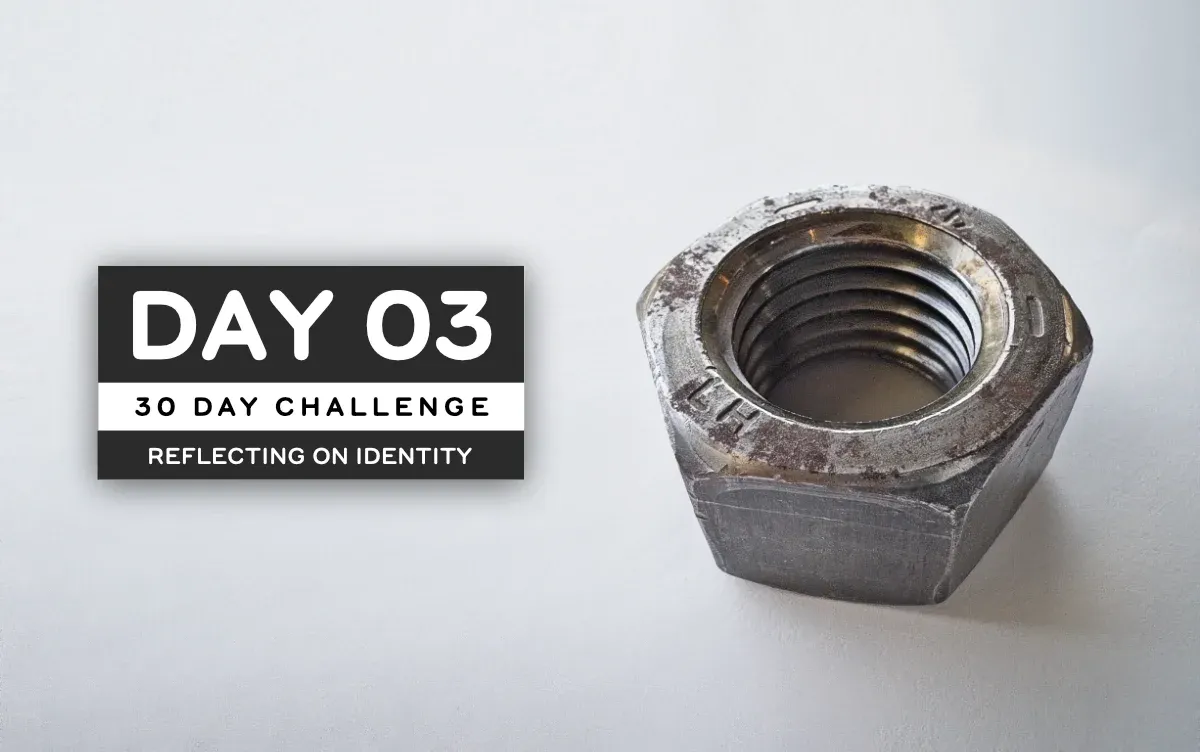
I also learned how to do cheeseball background image extension on the DAY 03 title picture, using Affinity Photo. I used to do this all the time in Photoshop; I feel that I’ve gained a tiny bit more expertise in the new program!
I looked at open source variable fonts too as this will be helpful both for my business identity and future CSS frameworks for text-heavy web application. But the day was largely spent looking at old work looking for something to steal from my past self and turn into a business card really quickly.
Build 02/30: Adding Typescript support to Eleventy
Build 04/30: Improving my Eleventy Atom Feeds
Chat about tools and aspirational projects on my DS|CAFE Discord server
Chat me up on Mastodon and Bluesky