Today’s sharepiece is an experiment using PowerPoint and Inkscape for resume layout instead of “pro” design software. I’ve provided the source files, but suspect using Canva is way easier for most people!

The Incentive
While talking to friend Mroobit about the employment landscape, I realized that I hadn’t updated my resume for a really long time. The last time I made one was around 2005 or so. Though I’d like to stay with freelance design so I have the time to work on my on projects, it seemed like a good idea to go through the process of bringing it up to date.
Since I’m doing this as part of a “Sharepiece Challenge”, I don’t have a lot of time to sink into it today. That said, I’ve been finding that even small bits of progress are helpful in seeding ideas for next steps, so I decided to refresh the old PowerPoint Resume Layout Tips article from way back in 2008. I also tried using the open source illustation program Inkscape to create something roughly equivalent as the “free” option.
Approach
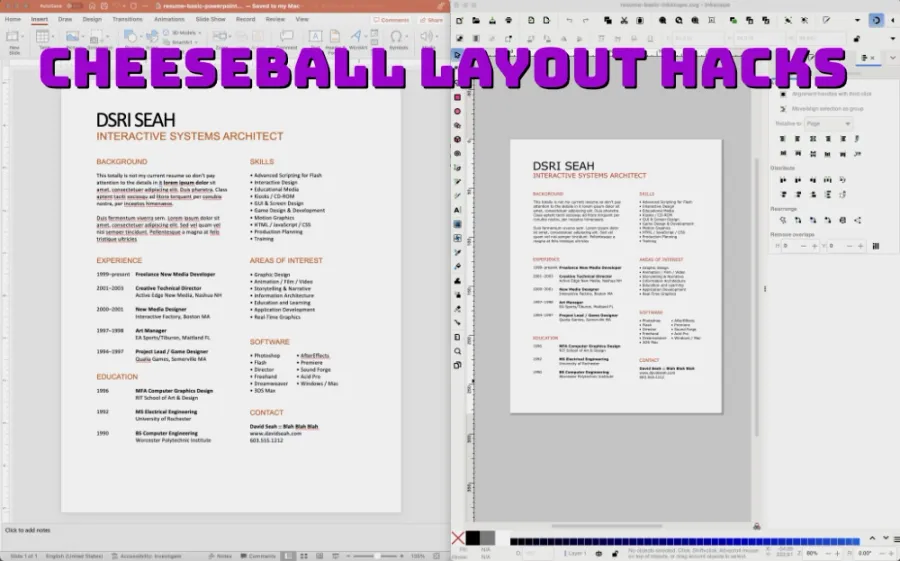
Updating the old PowerPoint file to PowerPoint 2021 was fairly straightforward, requiring just adjustment of the legacy text formatting autosizing and wrapping options.
Inkscape, on the other hand, was a bit more of a pain. It’s a very capable illustration program that’s comparable to older versions of Adobe Illustrator, but I think it’s harder to use than PowerPoint.
I limited myself to default fonts:
- For PowerPoint, I picked Calibri which has been the default font for Office for quite some time.
- For InkScape, I picked Sans which is the generic sans-serif font that’s available in all SVG documents.
Takeaways
I don’t think these are great options for doing simple layout for things like this. I’m sure that using Canva is the way better option for this. I wouldn’t waste my time with these templates, but I’ve provided them below in case anyone is interested.
Download ZIP archives
- Résumé Hack Powerpoint Version
- Résumé Hack Inkscape Version
I think it might be cool to create a pure HTML layout that internalizes the layout rules I follow:
- count information hierarchy levels
- create groups of information
- determine inter-line spacing
- derive inter-group spacing based on inter-line spacing multiple
- align and distribute groups
- adjust information hierarchy as needed for attractive layout
I’ve read that there are new CSS things that make baseline grid layouts possible…this is a long-missing typographic control for screen-based design! Something to dig into later, maybe starting here.
Here is a list of all related September 2025 “Sharepiece Challenges”
Announcing “Lightweight Daily Sharing”
Practice: “Eleventy CLI Proof-of-Concept”
MON: “Trying to Draw Cats”
TUE: “Resizing an Animated GIF of a Crab”
WED: “Making a Clonk Sound with Unfamiliar Music Tools”
THU: “Refresh of Emergent Task Timer for Lawyers”
FRI: “Refresh of Powerpoint Resume Template”
Sharepiece Evaluation!
For me personally, just digging up the old resume and playing with the format was a good way to start thinking about what I’d want to change. That helps me get unstuck! If I wasn’t making a sharepiece today, I probably would have blown off the entire project.
Conformance to Sharepiece Spec
Is lightly scoped?
MOSTLY. Scope crept into trying Inkscape.
Can be seen or held?
YEP. Download and open.
Easily shared?
YEP. Download link.
Elapsed Time:
2 hours, incl. blog post.
The idea behing this Sharepiece Challenge is to pick something that helps get unstuck with one’s creativity/productivity. After 5 days of this, I have a pretty good idea of how to structure this in the future. I’ll write about that in a separate post next week.
Sharepiece 4/5: Emergent Task Timer for Lawyers
A Bingo Board for Task Focusing
Chat about tools and aspirational projects on my DS|CAFE Discord server
Chat me up on Mastodon and Bluesky